top of page
E-Commerce Website Redesign
In 2024, Hello, Quebec's leading driver of local economic growth through purchase incentive campaigns, expanded into the scalable gift card market. To facilitate this strategic pivot, I led a multidisciplinary team in reimagining the Hello brand and enhancing audience engagement, beginning with a complete redesign of our flagship e-commerce platform.

Hello’s homepage
01.
The Context
Hello has been a catalyst for local economic growth since 2018, powering a wave of successful purchase incentive campaigns. Our solutions focus on rewarding customer spending through bonus offers and rewards. While we became a leader in this niche market in Quebec, our reach was ultimately constrained by the project-based nature of the work and limited marketing budgets.
In 2024, we shifted our focus to the significant scaling opportunity presented by the Canadian gift card market. This market consists of gift cards purchased at face value by consumers and businesses, without any required incentives. Capitalizing on this opportunity requires a strategic repositioning of Hello for both consumers and businesses.
02.
The Problem
Initially, Hello created dedicated e-spaces for each client’s promotional campaign, focusing on directing customers to these specific pages and keeping them engaged until they made a purchase or left. As a result, a traditional homepage was never a priority—functionality took precedence over aesthetics.
However, with Hello repositioning itself as a one-stop shop for browsing and purchasing gift cards, a refreshed homepage became essential to attract customers, enhance engagement, and drive sales.
Value prop: “Find the right gift card for the right person and the right occasion.”

A client’s dedicated e-space
03.
Research Goals
The primary objective of our research was to analyze user behavior related to gift card purchases and identify potential opportunities. Specific research goals included:
-
Identifying local market trends
-
Understanding user behavior and attitudes
-
Determining the motivations and purchase triggers (why and when)
-
Pinpointing user frustrations
-
Mapping the user's decision-making process

Participants' motivations for buying gift cards
04.
Survey
A pilot survey, focusing on consumer gift card purchase habits and behaviour, was conducted with Hello employees to ensure data relevance. The resulting data enabled us to refine the questionnaire before deploying it to our Hello members.
The survey findings, combined with secondary research data, were synthesized and categorized to reveal insights across industry trends, consumer preferences, behaviours, and challenges.

Research results organized by category
05.
User Stories & Tasks
Based on the research insights, I developed user stories for our consumer and corporate user groups. These user stories were then analyzed to extract goal-based tasks, leading to the identification of key functionalities.


User stories
06.
Prioritization
These key functionalities were prioritized using the Kano model to optimize development efforts.


Kano model
07.
Information Architecture
With a clear understanding of prioritized functionalities, I developed the website's information architecture, focusing on optimizing the browsing and purchase experiences.

Information architecture

Initial iterations
08.
Design Iterations
I had the opportunity to partner with a talented contract UI designer on this project. Together, we iterated on the website's landing and checkout pages, aiming to create a seamless shopping experience.
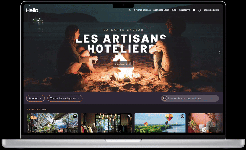
FINAL DESIGN
When users arrive on the landing page, they can efficiently browse and filter gift cards by region and category. The integrated search bar enables them to find specific gift cards by name, category or city.
This iteration enhances the user experience by showcasing gift cards through engaging visuals and a vibrant color palette. Furthermore, the design is fully responsive across various breakpoints.
The redesigned checkout experience prioritizes product clarity and provides an optimized, step-by-step process that guides users seamlessly. The design also allows effortless partner branding integration, which is a core business requirement.

Final design - Landing page

Final design - Gift card purchase process
Although changing business priorities resulted in the redesign project being postponed, I’m grateful for the experience. It was a pleasure working with an incredibly creative team, and the project itself allowed me to further develop my research and visual design skills.
This project was made possible by the collaborative efforts of Daniel Arsenault, UI Designer, and the Hello product, marketing, and development teams, who provided strategic direction and invaluable insights.
bottom of page